


.png)
35+ Best Website Widgets 2026
Widgets are everywhere these days, from online stores to booking platforms, and they vary widely in function and quality. Back in the day, they were pretty basic, but the latest versions have seriously stepped up their game. This guide breaks down different types of widgets and how to choose the right ones for your website in 2026.
What are Widgets?
A widget is a small interactive element placed directly on the page: a quiz, a chat bubble, a booking form, a sticky contact button, a review block. It is not the whole experience. It is one focused action, shown exactly where the visitor might need it.
They come in many shapes: floating buttons, pop-ups, sidebars, banners, or embedded forms. You’ve seen them on online stores helping you choose a size, or on landing pages showing a countdown or a cool limited-time offer. Some widgets even pull in external content, like live reviews or social media posts, to keep things fresh and engaging.
It’s easy to confuse widgets with plugins. Here’s the difference: plugins work behind the scenes; widgets sit on the screen where users can see and use them. They’re visual and interactive — designed to grab attention and guide users without making the website feel busy or complicated.
Benefits of Installing Website Widgets
Widgets can change the way people experience your website. A few small tools in the right places can make the site smoother, smarter, and more effective. Here’s what they bring to the table:
Make things easier for visitors: Clear steps, fewer clicks, and instant access to important information or actions help users complete tasks quickly. Finding a product, subscribing to a newsletter, or navigating to another page becomes faster and more intuitive with the right widgets.
Hold attention longer: Interactive tools like quizzes, carousels, or videos keep users engaged and increase the time they spend exploring your site. They encourage interaction, spark curiosity, and give users a reason to stay rather than bounce away.
Improve conversion rates: Smart widgets like countdown timers, lead forms, or product finders give visitors a reason to act while they’re still interested. These tools tap into urgency, personalization, or convenience, nudging people toward clicking that “Buy” or “Sign Up” button.
Add value without clutter: You get more features, better user flow, and increased functionality without needing a full redesign or slowing down the site. Modern widgets blend in seamlessly and are designed to be lightweight, fast-loading, and visually consistent with your brand.
Widgets Comparison Table
Before getting into the full list, here’s a quick way to look at the most common widget types. This isn’t a strict rulebook — the same widget can work very differently depending on the page — but it’s a useful starting point.
Top 35+ Widgets for Website 2026
Not every site needs dozens of widgets. Most pages only need a few, and only if they serve a clear purpose.
The list below covers the widget types that show up again and again across ecommerce, SaaS, service businesses, and content-heavy sites because they solve familiar problems: capturing leads, reducing hesitation, improving navigation, or helping people act faster.
To keep the list readable, the widgets are grouped by what they help with.
Lead Generation Widgets
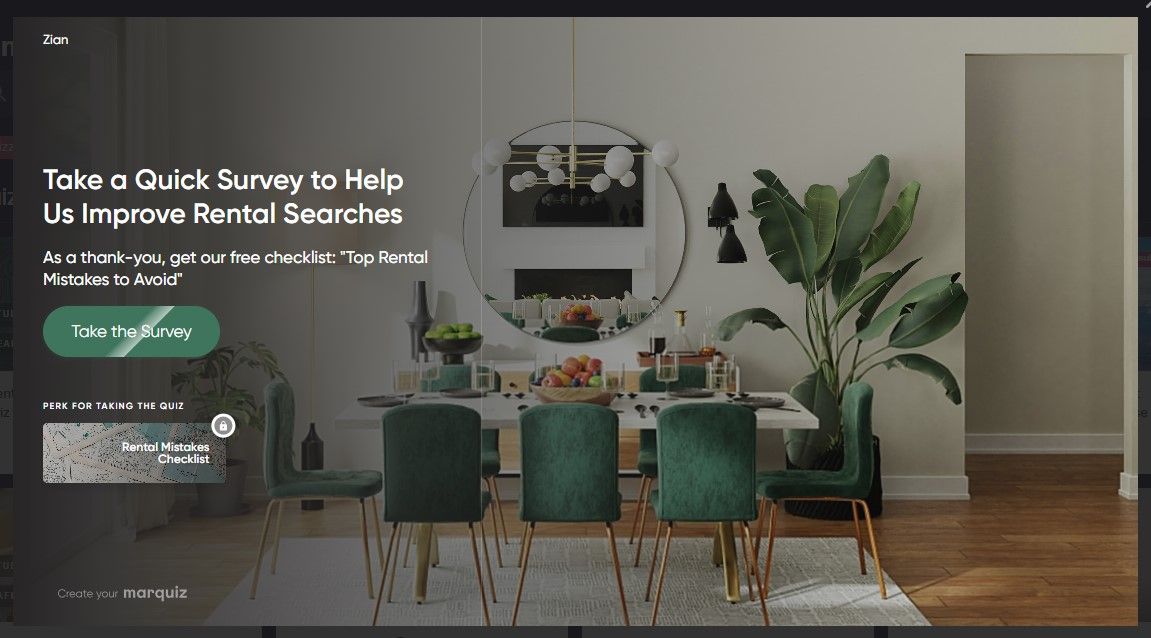
Most visitors won't fill out a contact form on the first visit. They're not ready, they don't trust you yet, or the form just doesn't give them a reason to act. Lead generation widgets solve this by replacing passive forms with something interactive: a quiz that helps people figure out what they need, a calculator that shows them a real number, a slide-in that appears at the right moment with the right offer. The goal isn't just collecting emails — it's capturing intent from people who are already interested, before they leave.
When to Use: Best for traffic from ads, blog posts, and landing pages where visitors need to be qualified or nudged toward action.
1. Lead Generation Quiz
A lead quiz asks visitors a few questions about what they need, then shows them something relevant based on their answers — a recommendation, an estimate, a plan. The key difference from a regular form is the order: you give value first, ask for contact details second. By the time someone reaches the email field, they've already invested a few clicks and seen something useful. That changes how the request feels. It's not "give us your email so we can follow up" — it's "we showed you something helpful, want us to send it to you?" That shift alone tends to lift conversion rates compared to a cold lead form.
When to Use: Best for landing pages receiving paid traffic where visitors need to be qualified before submitting contact details. Or directly land paid traffic on lead generation quiz.
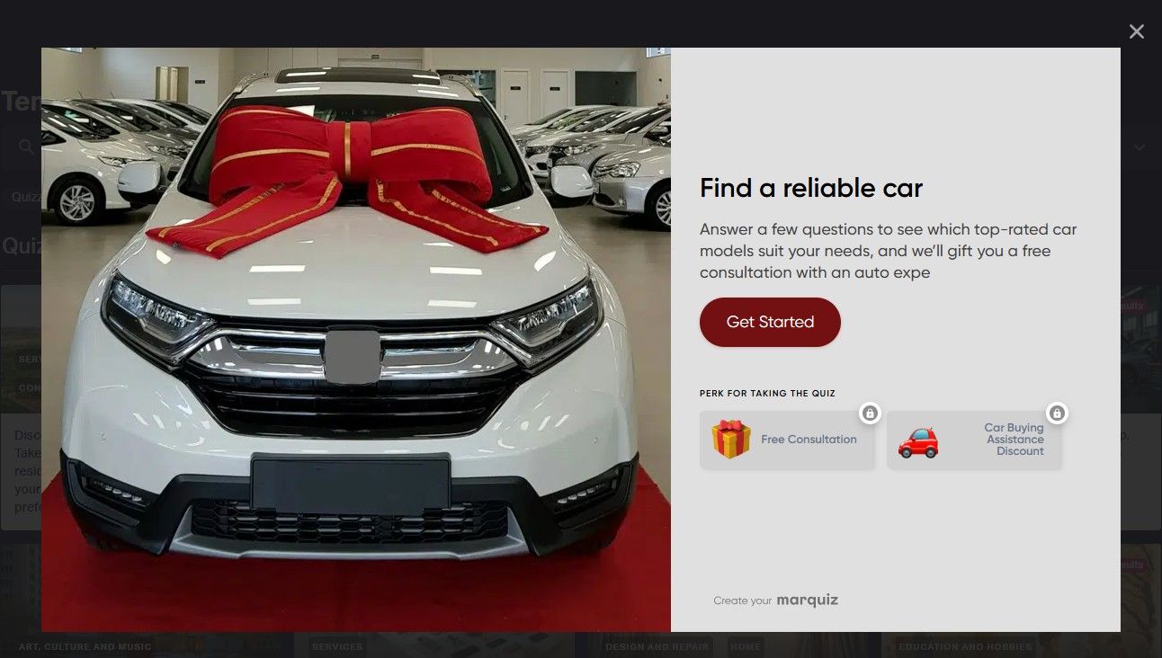
You can create one using tools like Marquiz, Outgrow, or Typeform with logic-based flows. Marquiz offers a smart, no-code widget with logic jumps, lead capture, and custom styling.
2. Online Calculator
An online calculator gives instant answers based on what users type in. It can show prices, delivery time, savings, or anything else that depends on their input. These widgets are great for service pages or product pages where people want quick estimates. They help remove guesswork and give users a clearer idea of what to expect before taking the next step.
When to Use: Add a calculator on pages where visitors are trying to estimate something before committing — pricing, savings, ROI, or delivery time. It removes uncertainty and gives users a sense of control, which makes them more comfortable moving to the next step. This is particularly effective for service businesses, SaaS pricing pages, and financial products.
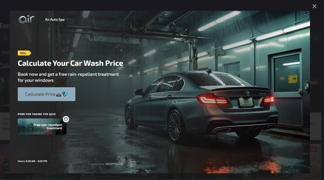
Platforms like Marquiz, Elfsight or ConvertCalculator let you build custom calculators for your site
3. Exit-Intent Popup
An exit-intent popup shows up right before someone leaves your site. It tracks mouse movement and triggers when a visitor heads toward the close button. You can use it to offer a discount, freebie, or reminder. This widget gives you one last chance to grab attention and turn a leaving visitor into a lead, subscriber, or customer.
When to Use: Use exit-intent popups on pages with strong informational value but high bounce rates, such as blog posts or landing pages. Instead of letting visitors leave without interaction, offer something relevant — a discount, checklist, or downloadable guide related to the content they were reading. This works best as a recovery mechanism rather than a primary conversion tool.
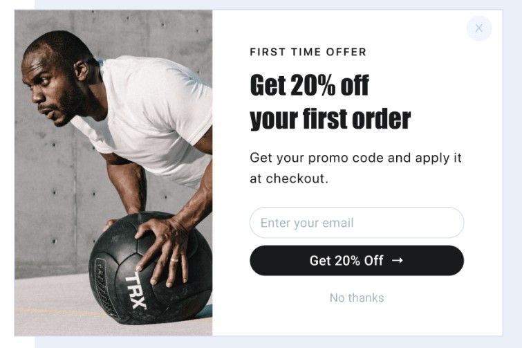
4. Email Opt-In Form
An email opt-in form is a small section where visitors can enter their email to subscribe, get a freebie, or stay updated. It can be a popup, slide-in, or built right into a page. These forms help you grow your email list and stay in touch with people who are already interested. Keep it short, clear, and offer something they’ll want.
When to Use: Email opt-in forms work best when they are tied to a clear value exchange. Rather than placing them randomly, integrate them into content where readers already see value — such as after educational sections, inside blog posts, or next to downloadable resources. When the offer feels like a natural extension of the content, sign-up rates increase significantly.
You can build stylish forms using Marquiz, Jotform, or Typeform to grow your email list.
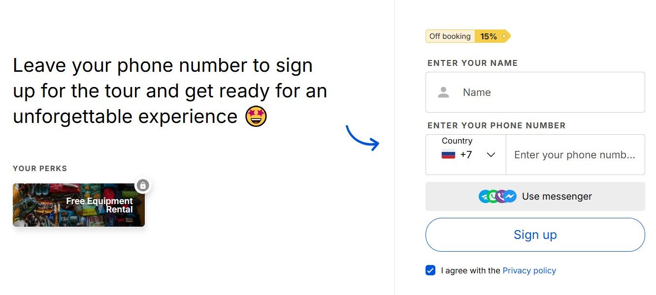
5. Appointment Booking Widget
An appointment booking widget lets people schedule a meeting, call, or visit without needing to contact you manually. They just pick a time that works, fill in a few details, and confirm. It’s great for service-based businesses and keeps everything organized. You can place it on contact pages, landing pages, or pop-ups to make booking quick and easy.
When to Use: Use booking widgets on pages where visitors are close to making a decision and may prefer a direct conversation instead of filling out forms. Service businesses, consultants, and agencies often place these widgets on pricing pages or contact sections to remove friction from scheduling. The key advantage is immediacy: visitors can lock in a time while their interest is still high.

You can try Calendly or SimplyBook.me to let users book time slots online.
6. Payment widget
A payment widget makes it easy to accept payments right on your website without sending users to a separate checkout page. It can handle credit cards, PayPal, or even mobile wallets, all within a secure pop-up or embedded form. Perfect for donations, services, or digital products, it helps reduce friction and boost conversions.
When to Use: Payment widgets are most effective when you want to shorten the path between intent and transaction. Instead of redirecting visitors to multiple checkout pages, the payment happens directly within the page context. This works particularly well for digital products, donations, quick services, or landing pages built around a single offer.
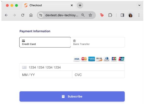
You can add one using tools like Stripe Checkout, Square, or PayPal Buttons.
Trust & Social Proof Widgets
People don't trust websites — they trust other people. Before someone buys, books, or signs up, they almost always look for a signal that someone else already did and it worked out. That's exactly what trust widgets provide. Reviews pulled from Google or Trustpilot, testimonials from real customers, star ratings next to a product — these aren't decorative. They're the thing that tips someone from "maybe" to "yes". The closer these widgets are to your call-to-action, the more work they do.
Impact on Conversion: Reduces friction, increases credibility.
7. Testimonial Slider
A testimonial slider displays reviews from real customers in a rotating format. It usually shows one or two at a time, keeping the page clean while adding trust. This widget works well on homepages, landing pages, or product sections. By showing honest feedback from others, it helps new visitors feel more confident about your product or service before they decide to act.
When to Use: Use testimonial sliders in sections where visitors naturally evaluate credibility — such as after explaining your product or before showing pricing. Rotating testimonials allow you to showcase multiple perspectives without overwhelming the page layout. When paired with real names, photos, or company logos, they significantly increase perceived trust.
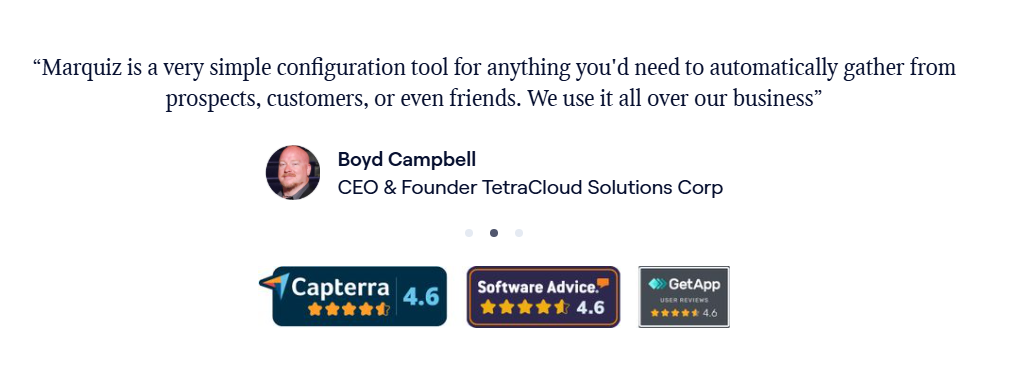
You can use builders like Elfsight or Commoninja for rotating testimonial displays.
8. Live Visitor Counter
A live visitor counter shows how many people are currently browsing your site or a specific page. You’ll often see it on product or registration pages to build trust and show real-time interest. It adds a bit of social proof and urgency — if others are looking, maybe it’s worth acting now. Simple, effective, and great for boosting engagement.
When to Use: A live visitor counter works best on pages where real-time activity reinforces demand. This includes event registrations, limited launches, or high-interest product pages. When visitors see that others are currently browsing or buying, it creates subtle social validation that the offer is worth attention.
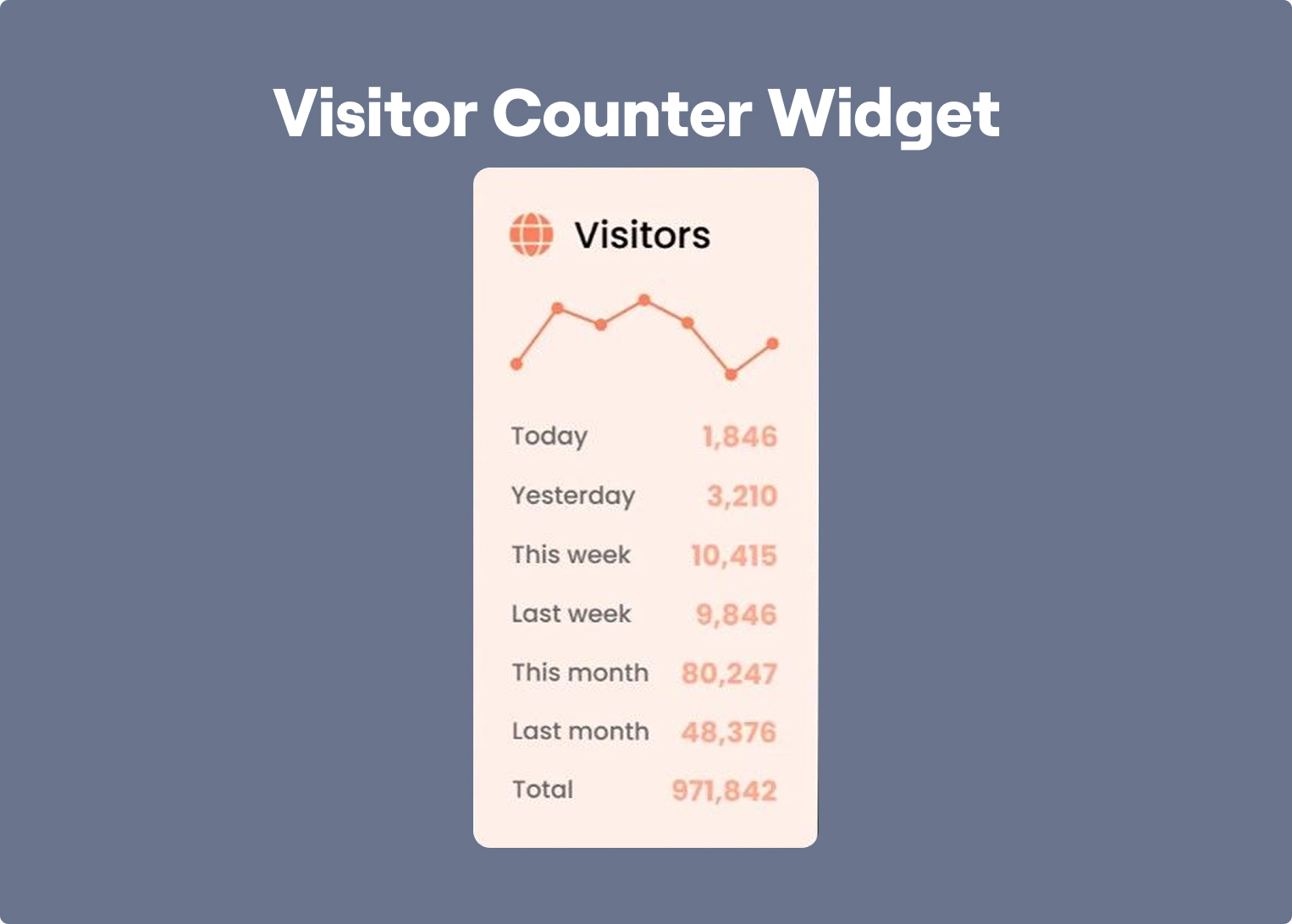
You can add real-time visitor counts using Hotjar or Crazy Egg.
9. Review Aggregator Widget
This widget pulls in ratings and reviews from multiple platforms — like Google, Trustpilot, or Yelp—and displays them in one spot. It saves visitors the trouble of searching and builds credibility at a glance. You’ll usually see it on homepages, product pages, or near call-to-action sections. More reviews, more trust, better conversions.
When to Use: Place aggregated reviews near decision points where visitors need reassurance — for example near pricing tables, product descriptions, or signup forms. Pulling reviews from trusted platforms like Google or Trustpilot helps eliminate the need for visitors to leave your site to verify credibility. This makes the decision process smoother and faster.
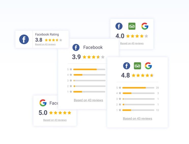
You can use Reviews On My Website, JustReview or Elfsight to pull reviews from multiple platforms into one display.
Engagement & Interaction Widgets
Reading about something is one thing — actually interacting with it is different. Engagement widgets give visitors a way to participate: answer a question, watch a demo, listen to a podcast, share their opinion. This matters for conversion because time on page correlates with trust, and people who interact with something are more likely to remember it. These widgets work best when they're placed in the natural flow of a page, not tacked on as an afterthought.
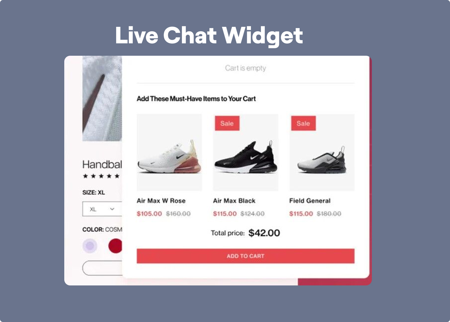
10. Live Chat Widget
Live chat widgets sit in the corner of your site and let visitors ask questions right away. It opens a small window where they can chat with a support person or a chatbot. It’s a fast way to offer help and keep people from leaving when they’re unsure about something. You’ll often see them on sales pages, service pages, or checkout screens.
When to Use: Live chat works best on pages where visitors may hesitate because of unanswered questions. Product pages, service explanations, and checkout flows are typical areas where quick clarification can prevent abandonment. Whether handled by a support agent or chatbot, chat widgets create a sense of immediate assistance.
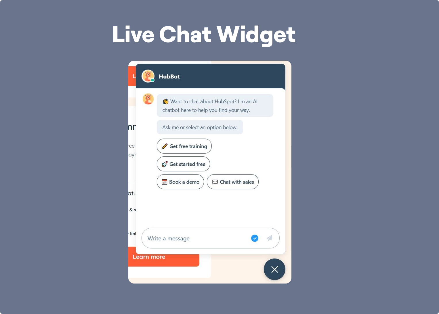
You can get one from Drift, or Intercom to talk with visitors in real-time.
11. Social Media Feed
A social media feed shows your latest posts from Instagram, X, or other platforms right on your site. It can show up as a grid, slider, or scrolling section. This widget helps keep your website fresh and gives visitors a quick look at your latest content. It also encourages people to follow you without sending them away from the page.
When to Use: Embed social feeds on pages where brand personality or community activity matters. For example, lifestyle brands, creators, or travel companies often use them to show real-world usage of their products. This type of content adds freshness to the site and reinforces that the brand is active beyond the website itself.
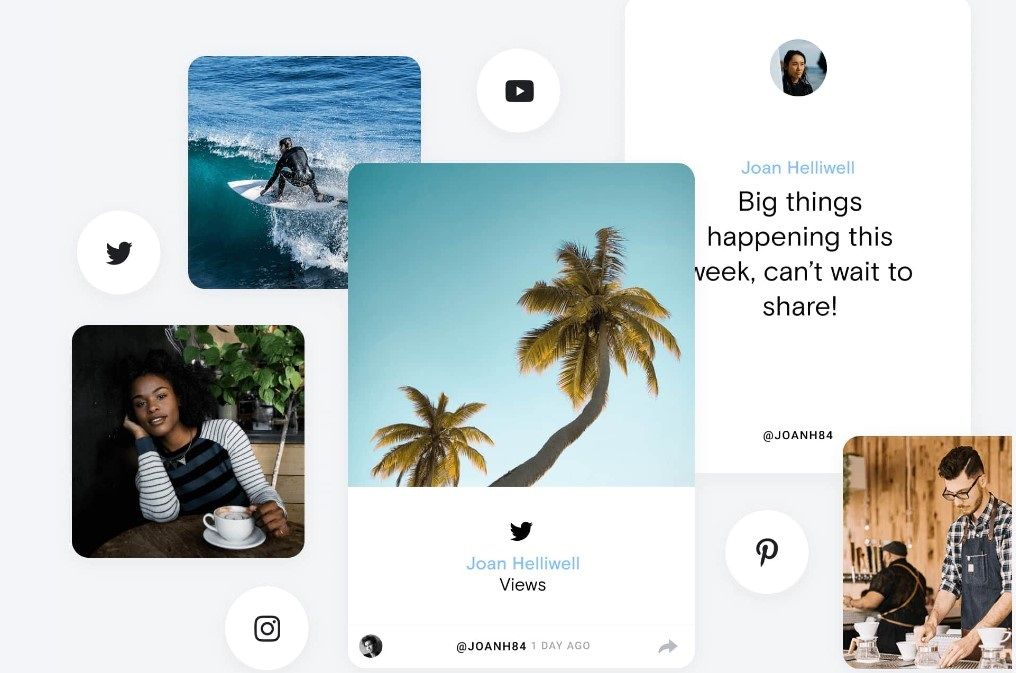
You can try Curator.io or EmbedSocial to embed live social posts on your site.
12. Survey or Poll Widget
A survey or poll widget lets you ask quick questions and collect feedback right on your site. It can appear as a pop-up, slide-in, or embedded section. Visitors just click their answer — no typing needed. These widgets are great for learning what your audience wants, testing ideas, or getting opinions before a product launch. They keep things simple while giving you valuable insights.
When to Use: Surveys and polls are useful when you want quick insights without requiring long forms. They work well on blog pages, product launches, or feature announcements where you want to gauge visitor preferences. Because they require minimal effort from the user, participation rates are typically high.
You can use tools like SurveyMonkey or Typeform to create interactive surveys or polls.
13. Audio Player Widget
An audio player widget lets visitors play sound clips, podcasts, or music directly on your site. It shows simple controls like play, pause, and volume, usually in a compact bar. It’s great for media, learning, or storytelling sites that want to keep users listening without sending them elsewhere. You can place it in a post, footer, or sidebar.
When to Use: Use audio widgets when your content is designed to be consumed passively — such as podcasts, storytelling, or educational audio lessons. They allow visitors to stay engaged with your content while multitasking, which can significantly increase time spent on the page.
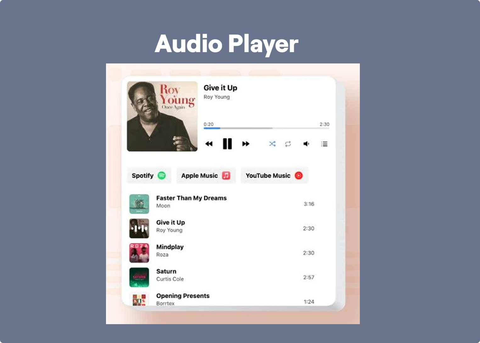
You can use CommonNinja or Elfsight for clean audio players.
14. Video Embed Widget
A video embed widget lets you easily drop videos from YouTube, Vimeo, or your own server into your site. Whether it’s tutorials, product demos, or interviews, videos help engage visitors and explain things fast. The widget adapts to screen sizes and plays directly on the page, no redirects. You can place it in posts, landing pages, or popups to keep things dynamic and visual.
When to Use: Video widgets are particularly valuable on landing pages where complex ideas need to be explained quickly. Product demos, tutorials, and walkthroughs often communicate value faster than text alone. When placed strategically above or near calls to action, videos can significantly increase engagement.

You can easily embed video using YouTube, Vimeo, or site builders like VideoAsk and FacePop.
Urgency & Scarcity Widgets
The most common reason people don't convert isn't that they're not interested — it's that they plan to come back later and don't. Urgency and scarcity widgets interrupt that pattern by making the cost of waiting visible: a deadline that's actually real, a stock level that's actually limited, an offer that genuinely expires. When these widgets reflect something true, they work. When they're fake — a countdown that resets every day, a "only 2 left" that never changes — visitors notice, and it kills trust faster than no widget at all.
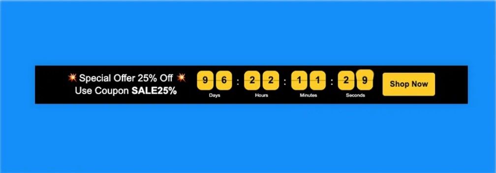
15. Countdown Timer
A countdown timer widget shows a ticking clock for limited-time offers, sales, or events. It creates a sense of urgency and pushes visitors to act before time runs out. You’ll usually see it on product pages, landing pages, or pop-ups. It’s a simple way to drive faster decisions and boost conversions without saying much—just let the timer do the talking.
When to Use: Countdown timers work best in campaigns with genuine time limits — product launches, flash sales, webinar registrations, or seasonal offers. By visualizing the remaining time, they push visitors to make decisions faster instead of postponing them. The key is authenticity: when the deadline is real, the urgency feels credible.
Widgets from Logwork or Widg.io make it easy to add urgency with countdowns.
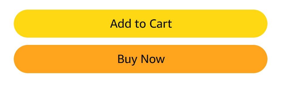
16. E-commerce Add to Cart Popup
This widget appears right after someone adds a product to their cart. It confirms the action and often shows the cart total, product image, and buttons to keep shopping or check out. It keeps users in the loop without pulling them away from the page. It’s a small touch that makes the buying process smoother and helps reduce cart abandonment.
When to Use: This widget is most effective on online stores where the goal is to keep visitors moving through the purchase flow. Instead of redirecting users to the cart page, the popup confirms the action while allowing them to continue browsing. This reduces friction and increases the likelihood of additional purchases.
You can use tools like CartBounty or WooCommerce Add-to-Cart Popup to show cart popups.
17. Mobile App Download Prompt
A mobile app prompt encourages visitors to download your app when they visit your site on a phone. It appears as a banner or pop-up with a link to the App Store or Google Play. This widget helps drive app installs from people already interested in your brand. It’s subtle but effective — especially if your app offers extra perks.
When to Use: Use mobile app prompts when your app provides a noticeably better experience than the website — for example faster browsing, loyalty rewards, or exclusive features. These prompts work best for returning visitors or mobile-heavy audiences who already interact with your brand frequently.

Platforms like Smart App Banners, Branch.io, or PWA install prompts help promote app downloads.
Navigation & UX Widgets
Conversion doesn't only depend on what's on the page — it depends on whether people can actually get to it. Navigation and UX widgets reduce the friction between arriving and acting: a floating button that stays visible no matter how far someone scrolls, a search bar that saves them from digging through menus, a progress indicator that keeps them going through a multi-step form. These widgets rarely get credit for driving conversions, but when they're missing, the drop-off is immediate. They're the infrastructure that makes everything else on the page work.
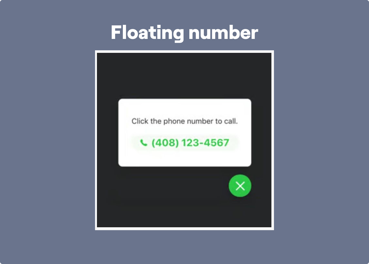
18. Floating Contact Button
A floating contact button sits on the edge of your screen and stays visible as users scroll. When clicked, it opens up options — like a form, phone number, or email. This makes it easy for visitors to reach out at any point without hunting for your contact info. It’s simple, helpful, and makes your site more user-friendly.
When to Use: Floating contact buttons are especially useful on long landing pages where contact information might otherwise require scrolling. By keeping the contact option visible at all times, they remove friction from reaching out. This is particularly helpful for service-based businesses or local companies.
You can use GetButton or Elfsight to add a floating button for calls, WhatsApp, or forms.
19. Announcement Banner
An announcement banner is a wide strip at the top of your site that shares quick updates — like promos, shipping info, or news. It stays visible without blocking anything and usually includes a short message with a link or call-to-action. It’s a handy way to highlight important info without needing pop-ups or extra pages. Easy to spot, hard to miss.
When to Use: Announcement banners work well when you need to communicate something important across the entire site — such as limited promotions, shipping delays, or product launches. Because they appear at the top of the page without interrupting the experience, they are noticeable yet non-intrusive.

Tools like Hello Bar, Sleeknote, or BarRaider let you add announcement bars to the top or bottom of your site.
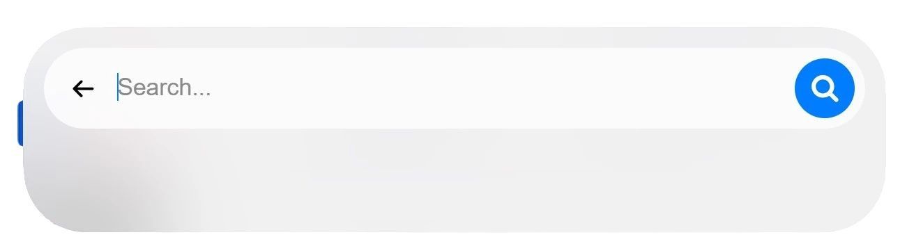
20. Search Bar Widget
A search bar widget lets visitors quickly find what they’re looking for by typing in keywords. It’s usually placed in the header or as a floating icon. This widget improves navigation and saves users from clicking through endless menus. Whether it’s a blog, store, or service site, a solid search bar keeps people engaged and helps them get to the right info fast.
When to Use: Search bars become critical as the amount of content on a website grows. On large blogs, documentation portals, or e-commerce stores, visitors often prefer searching over browsing menus. A prominent search function helps users quickly locate the information they need, improving overall usability.
You can add a site search bar with tools like Searchbar or SearchStax.
21. FAQ Accordion
An FAQ accordion organizes common questions into clickable sections that expand when opened. It keeps pages tidy and easy to scan. Instead of scrolling through a long list, visitors can just click the questions they care about. You’ll often see this widget on service pages, checkouts, or product info sections to answer doubts before people reach out or leave.
When to Use: Use FAQ accordions in areas where visitors typically have objections or uncertainties. Pricing sections, checkout pages, or product descriptions are common places where questions arise. By answering them directly on the page, you reduce hesitation and prevent unnecessary support requests.
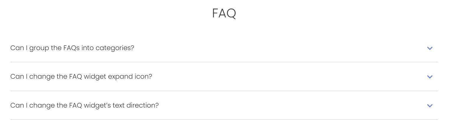
Platforms like Accordion FAQ by Elfsight offer collapsible Q&A layouts.
22. Progress Bar
A progress bar widget shows how far someone has gotten through a process — like filling out a form, quiz, or checkout. It usually appears as a line or steps across the top. This little visual cue keeps users motivated to finish by showing them what’s left. It helps reduce drop-offs and makes longer tasks feel more doable.
When to Use: Progress bars are especially useful in multi-step experiences such as forms, quizzes, onboarding flows, or checkout processes. They visually communicate how much effort remains, which helps users stay motivated to complete the process instead of abandoning it midway.
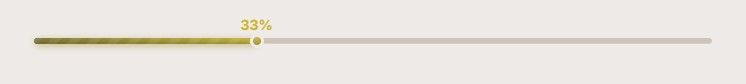
You can add visual progress indicators with tools like WPForms or Formidable Forms.
23. Floating Menu or Quick Navigation
This widget adds a compact menu that stays on screen as users scroll. It’s perfect for long pages or one-pagers, letting visitors jump to key sections without scrolling forever. Whether it’s a sticky side menu or bottom tab bar, it improves usability and keeps important links just a tap away. Great for guides, landing pages, or mobile-first sites.
When to Use: Floating navigation menus are valuable on long-form pages like guides, landing pages, or documentation. They allow users to jump directly to relevant sections without scrolling through the entire page. This improves usability and helps visitors quickly find the information they came for.
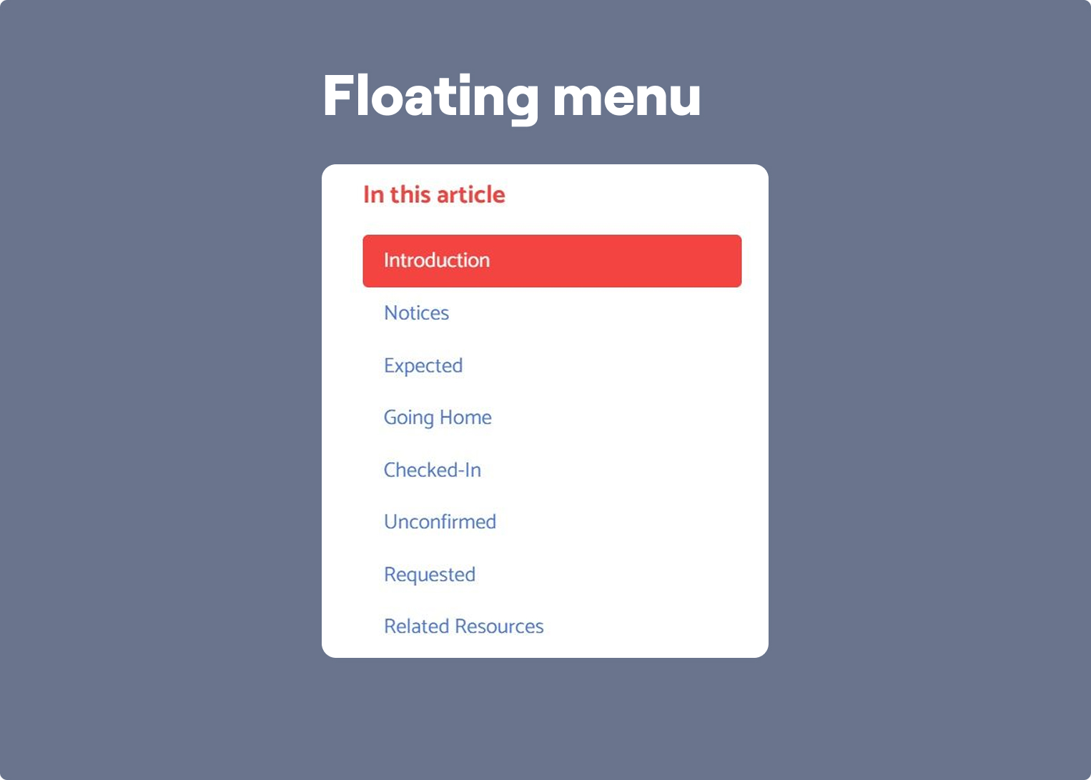
You can use plugins like My Sticky Bar or WP Floating Menu for sticky navigation bars.
24. Form Auto-Save or Resume Later
This widget automatically saves a user’s progress while filling out a form. If they leave and return later, their info is still there — no need to start over. It’s super helpful for long applications, quizzes, or checkouts. By reducing frustration, it improves form completion rates and gives users more flexibility. You can also add a “Save and finish later” button for extra clarity.
When to Use: This widget becomes essential when your forms or applications require more than a minute or two to complete. Long onboarding forms, job applications, insurance forms, or complex quizzes often lose users simply because people get interrupted. Auto-save removes that friction by letting visitors safely leave and return later without losing progress, which can dramatically increase completion rates for longer processes.
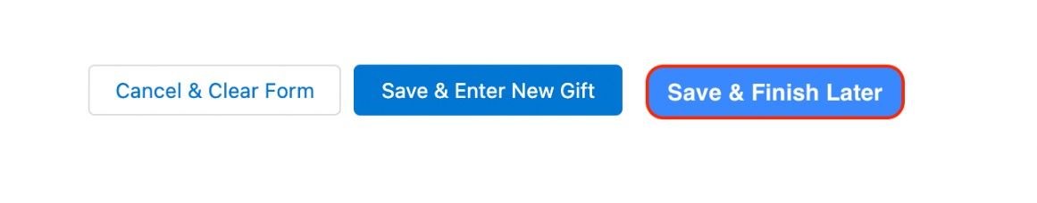
You can use advanced form builders like Typeform, Jotform, or Formstack with save/resume features.
25. Interactive Map Widget
An interactive map widget shows your location and lets users zoom in, get directions, or click on multiple spots. It’s often used by stores, offices, or events with more than one location. Unlike a plain address, this map makes it easy for people to see where you are and how to get there. You’ll usually find it on contact or location pages.
When to Use: Interactive maps are most useful for businesses with physical locations or events where users need quick geographic context. Instead of listing addresses in text form, a map lets visitors immediately understand where you are, how to get there, and what nearby locations exist. This works particularly well on contact pages, location pages, and event landing pages.

You can use Google Maps Embed, Mapbox, or uMap for clickable, zoomable maps with custom markers.
26. Blog Post Carousel
A blog post carousel displays a scrollable row of articles, usually by category or most recent. It saves space while letting visitors explore more content. You’ll often find it on homepages or blog sections to keep users reading and boost page views. With clickable titles, thumbnails, and short descriptions, this widget makes it easy to find something interesting fast.
When to Use: Blog post carousels work best on homepages, blog hubs, and at the end of articles where the goal is to keep readers moving deeper into your content. Instead of presenting a flat list of links, they help surface featured or related posts in a way that feels lighter and more dynamic. This is especially useful for content-driven websites that rely on session depth and page views.
Widgets like JetElements or Smart Slider let you highlight recent posts.
27. Social Share Buttons
Social share buttons let visitors quickly post your content to platforms like Facebook, X, or LinkedIn. These small icons usually sit at the top, bottom, or side of blog posts and product pages. They help increase visibility and drive traffic from social media without extra effort. Easy to spot, one-click to share — it’s a simple way to spread the word.
When to Use: Use social share buttons on pages that already have standalone value and are worth recommending to others — blog posts, guides, research pages, case studies, or resource hubs. They work best when the content solves a clear problem, delivers a useful insight, or makes a point people would want to pass along. In those cases, the buttons turn passive readers into an organic distribution channel.

You can try AddToAny or Divi to add social sharing icons.
28. Push Notification Widget
Push notification widgets let users subscribe to alerts — even after leaving your site. You can send updates about new posts, discounts, or announcements straight to their browser or phone. It’s a direct way to stay top of mind without relying on email. Usually triggered by a prompt on the first visit, this widget helps bring people back with timely reminders.
When to Use: Push notifications are most useful when your business depends on repeat visits and time-sensitive communication. They work well for media sites, blogs, eCommerce brands, and SaaS products that regularly publish updates, launch offers, or release new content. Their main strength is re-engagement: they help you bring users back without asking them to open an email first.

Services like PushAlert, or OneSignal offer browser push notification tools.
29. Event Calendar Widget
An event widget highlights upcoming events right on your site — whether it’s a webinar, concert, class, or in-store meetup. It shows dates, times, locations, and even RSVP or ticket buttons. Great for community-driven sites, nonprofits, or anyone hosting regular happenings. You can place it in the sidebar, footer, or as a full section to make sure visitors never miss what’s coming up.
When to Use: Event calendars are a strong fit for businesses and organizations that run recurring webinars, classes, meetups, launches, or community events. Instead of scattering event information across separate pages or posts, the calendar gives visitors one structured place to understand what is happening and when. That makes it easier to discover events, compare options, and commit faster.
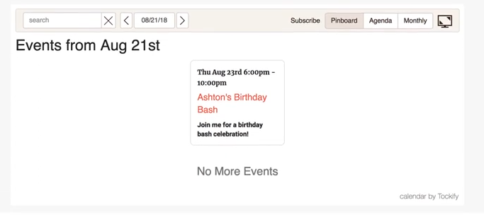
You can use Time.ly or Tockify Calendar to showcase upcoming events.
30. Product Recommendation Widget
This widget suggests products based on what a visitor is viewing or has bought before. You’ll often see it under product pages or in shopping carts. It helps users discover more of what they like and can increase the chances of extra sales. By showing personalized options, this widget makes shopping easier and keeps people exploring longer.
When to Use: Product recommendation widgets are most effective when visitors already show buying intent and are deciding what to choose next. They work especially well on product pages, cart pages, and post-add-to-cart moments where the user is still in shopping mode. In that context, recommendations do not feel random — they feel helpful, and they can increase both relevance and average order value.
Platforms like Wisepops or Recom.ai offer AI-driven product suggestion widgets.
31. Product Carousel or Slider
A product carousel (or slider) displays several items in a row that users can scroll or swipe through. It’s commonly used on homepages, featured sections, or product pages. This widget lets you highlight bestsellers, new arrivals, or sale items in a clean, space-saving way. It helps users explore more without feeling overwhelmed by a long list.
When to Use: Use a product carousel when you want to surface a curated set of items without forcing users through a dense catalog view. It works particularly well for bestsellers, seasonal collections, new arrivals, or related products shown on high-traffic commercial pages. The format is useful when discovery matters, but screen space is limited.
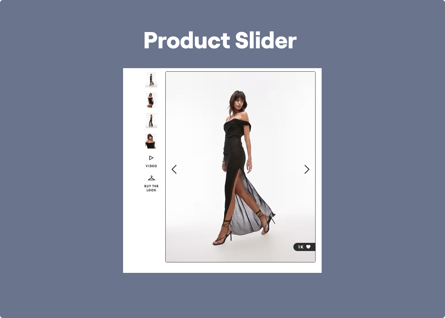
You can use GLO Shopify App or Woocomerce to create interactive product sliders.
32. Wishlist Widget
A wishlist widget lets users save products they like to come back later — no cart needed. It’s great for e-commerce sites, especially those with lots of options. Users can log in or use cookies to store their picks, and some widgets even send reminders or updates. It helps boost conversions by keeping your products top of mind and gives shoppers a smoother way to plan purchases.
When to Use: Wishlist widgets are especially valuable in eCommerce when users are comparing products, browsing on mobile, or not ready to buy in one session. They reduce the pressure to decide immediately while keeping products tied to future purchase intent. This is particularly useful for larger catalogs, fashion, gifting, or higher-consideration products.
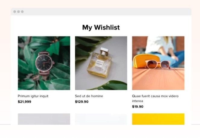
You can add a wishlist widget using tools like TI WooCommerce Wishlist or Elfsight.
33. Cookie Consent Banner
This widget shows a small banner asking visitors to accept or manage cookies when they land on your site. It’s required in many places for privacy laws like GDPR. Most banners appear at the bottom of the screen with a short message and buttons to accept or learn more. It keeps your site compliant and shows users you take their privacy seriously.
When to Use: Cookie consent banners are necessary when your website uses analytics, advertising, or third-party tracking that requires consent. They are not primarily about conversion — they are about compliance, transparency, and user control. The best implementations make consent management clear without overwhelming the visitor or disrupting the first interaction more than necessary.
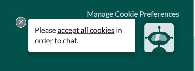
You can get compliant using CookieYes or Osano for a GDPR-ready cookie banner.
34. Weather Widget
A weather widget displays local weather updates — like temperature, rain, or wind — in real time. It pulls info based on a visitor’s location and can be placed in the header, sidebar, or homepage. It’s especially useful for travel, outdoor, or local event websites. It gives visitors helpful info without needing to leave the house.
When to Use: Weather widgets are useful when real-world conditions directly affect the visitor’s next decision. That makes them relevant for travel websites, outdoor events, tourism businesses, sports venues, and local activity pages. In those cases, weather is not decorative information — it is part of the decision-making context.
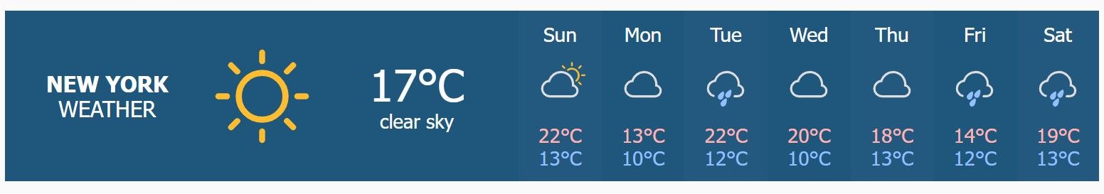
Sites like WeatherWidget.io, or Ventusky offer embeddable weather widgets.
35. PDF Viewer Widget
A PDF viewer widget allows you to embed PDF documents directly into your website pages or blog posts. This is particularly useful for sharing brochures, catalogs, reports, or whitepapers without requiring visitors to download files. It enhances user experience by providing easy access to important documents within the site itself.
When to Use: PDF viewers work best when the document itself is part of the value proposition — for example whitepapers, brochures, reports, menus, catalogs, or downloadable resources. Instead of forcing an immediate download, embedded viewing reduces friction and lets users preview the content first. This is especially effective on lead generation pages and resource libraries.
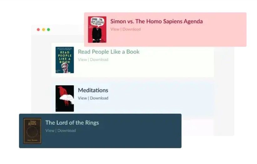
You can implement this using tools like Powr or CommonNinja.
36. Donation Widget
A donation widget makes it easy for visitors to support your cause, project, or content. It adds a button or form where users can send money via platforms like PayPal, Stripe, or dedicated fundraising tools. You can customize amounts, add messages, or offer perks. Ideal for nonprofits, creators, or community projects looking for support without needing a full donation page.
When to Use: Place donation widgets on pages where visitors already feel connected to your cause — for example after impact stories, project updates, or community campaigns. Instead of sending users to a separate donation page, the widget allows them to contribute instantly while their motivation is still high. This approach works especially well for nonprofits, independent creators, and community-driven projects.
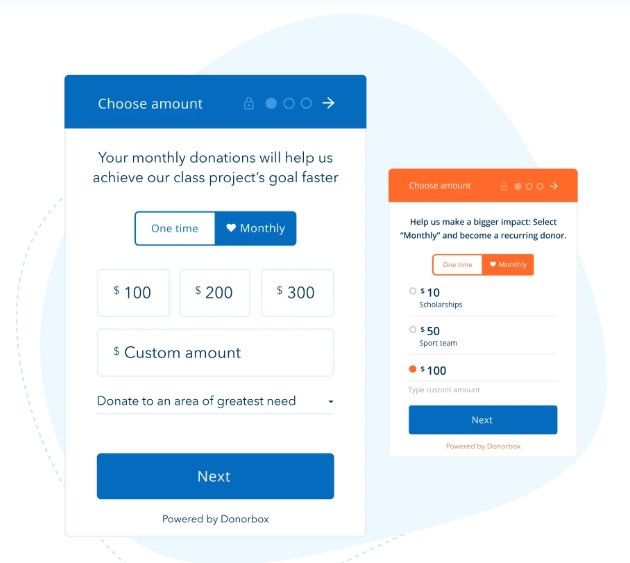
You can use platforms like PayPal Donate Button, Donorbox, or Ko-fi to add donation options to your site.
How to Choose the Right Widget
A widget should help the visitor move one step forward. If it doesn’t do that, it just adds noise to the page.
The easiest way to choose the right widget is to look at three things: where your traffic comes from, where the visitor is in the funnel, and what type of business you run. The same widget can perform very differently depending on those factors.
Based on Traffic Source
Visitors behave differently depending on how they arrived.
Traffic from ads usually has a clear question or intent. These users want quick answers and a simple next step. Widgets like quizzes, calculators, or booking widgets work well here because they help visitors quickly understand if your offer fits them.
For example, if someone clicks an ad for “home renovation cost,” landing them on a page with a cost calculator works much better than sending them to a generic homepage.
Traffic from blog posts or SEO behaves differently. These visitors are still researching. They may not be ready to talk to sales yet, but they might be willing to interact with something useful. In this case, quizzes, gated guides, or exit-intent offers often perform better than aggressive lead forms.
The key idea is simple:
match the widget to the intent of the traffic.
Based on Funnel Stage
Widgets should support what the visitor is trying to do at that specific stage.
At the top of the funnel, people are still exploring. Engagement widgets work best here: quizzes, polls, interactive content, or social proof elements that help them understand the problem or solution.
In the middle of the funnel, visitors are comparing options. This is where widgets that reduce uncertainty start working better — things like testimonials, review widgets, chat widgets, or calculators.
At the bottom of the funnel, the goal is removing friction. Visitors already understand the offer, they just need a reason to act now. Booking widgets, payment widgets, countdown timers, or add-to-cart confirmations tend to perform best here.
A common mistake is putting the same widget everywhere.
A blog article, a pricing page, and a checkout page all need different support.
Based on Business Model
Different businesses rely on different types of widgets because the decision process is different.
For eCommerce, discovery and trust matter most. Widgets like product recommendations, star ratings, reviews, wishlists, and countdown timers help people choose products faster and feel confident about the purchase.
For SaaS, the challenge is usually explaining the product. Quizzes, calculators, demo booking widgets, and chat widgets help visitors understand whether the tool fits their workflow.
For service businesses, the goal is usually to start a conversation. Booking widgets, quote calculators, testimonial sliders, and floating contact buttons work well because they make it easier for visitors to take that next step.
There’s no universal “best widget.” The right one is simply the one that helps your visitor move forward without overthinking it.
Common Mistakes When Using Website Widgets
Widgets can lift conversion, but they can just as easily hurt it when they are added without a clear job. In practice, the damage usually shows up in obvious places: lower click-through rates, higher bounce, weaker form completion, or more abandoned sessions. The issue is rarely the widget itself. It is usually poor timing, bad placement, or a mismatch between the widget and the page’s actual purpose.
❌ Too Many Widgets
This is one of the fastest ways to make a page feel chaotic. A chat bubble, a countdown timer, an exit-intent popup, a sticky banner, and a floating contact button may all look justified in isolation. On the page, though, they compete for the same thing: attention.
That competition has a cost. Instead of guiding the visitor toward one decision, the page keeps interrupting them with five. On a paid landing page, that often means weaker scroll depth, lower CTA clicks, and more drop-off before the main action.
A common example is a lead-gen page that already has a form above the fold but also runs a popup for newsletter signup, a floating WhatsApp button, and a sticky discount bar. Rather than increasing conversion points, this setup often dilutes the main one.
✅ To do instead:
Prioritize the primary conversion goal of the page and support that goal only. If the page is meant to generate demo requests, keep the elements that help users book or ask a relevant question — and remove everything competing with that outcome.
❌ Poor Targeting
Even a good widget performs badly when it appears in the wrong context. A booking widget shown to a first-time blog reader is often too aggressive. A trust widget buried at checkout is often too late. The problem is not the format — it is the mismatch between the widget and the visitor’s intent.
This usually shows up when teams deploy one widget sitewide and expect it to work everywhere. But a visitor reading an educational article, a visitor comparing pricing, and a visitor returning to a product page are not in the same decision stage. They should not be seeing the same prompt.
For example, an exit-intent popup offering “Book a demo” may underperform on blog traffic but work well on pricing pages, where the visitor is already evaluating options and closer to action.
✅ To do instead:
Trigger widgets based on page type, funnel stage, or user behavior. Educational content usually needs softer next steps, such as a guide, quiz, or email opt-in. Commercial pages can support stronger actions, such as demo booking, checkout prompts, or live chat.
❌ Ignoring Mobile Experience
A widget that feels acceptable on desktop can become unusable on mobile. Full-width popups, overlapping sticky buttons, floating bars that cover content, and small close icons all create friction that is much more damaging on a phone than on a laptop.
This is not just a design problem. It affects outcomes. If a widget blocks the CTA, hides product details, or makes the page harder to scroll, visitors leave before converting. On mobile-heavy traffic sources, especially paid social, this can quietly drag down campaign performance.
A typical example is a mobile landing page that shows a cookie banner, a sticky CTA bar, and a chat button at the same time. Together, they can cover a large part of the screen and make the content feel cramped before the user has even read the offer.
✅ To do instead:
Treat mobile as a separate experience, not a smaller desktop. Check whether the widget still feels usable on a phone, whether it covers key content, and whether it competes with taps or scrolling. In many cases, reducing the number of active widgets on mobile improves performance more than adding new ones.
❌ No A/B Testing
Many teams install a widget, see that it “works,” and stop there. That leaves a lot of performance on the table. Widgets are unusually sensitive to small variables: timing, copy, placement, trigger conditions, and visual weight.
A countdown timer at the top of a landing page can feel pushy and reduce trust. The same timer placed next to a real deadline near the CTA may improve response. A chat widget that opens immediately can annoy visitors. The same widget triggered after time on page or exit intent may support conversion instead of interrupting it.
Without testing, teams often mistake presence for effectiveness.
✅ To do instead:
Test the variables that change user behavior most: where the widget appears, when it appears, and what it asks the visitor to do. Start with one change at a time and evaluate it against a clear metric — form completion, CTA click-through, booked calls, or checkout progression — rather than vague "engagement."
Conclusion
Website widgets are tools, not magic. Adding a countdown timer or a popup won't fix a broken offer or an unqualified traffic source. Widgets amplify what's already working — they don't replace it.
Conversion depends on targeting and timing. A well-placed quiz on a paid traffic landing page will consistently outperform a generic lead form. A testimonial slider shown after your pricing section will do more work than the same block buried in the footer. The widget matters less than where and when it appears.
The strongest category to start with is interactive widgets — especially quizzes. They do two things at once: they engage the visitor (keeping them on the page longer) and segment them by intent (showing you who is serious and what they need). That combination — engagement plus segmentation — is what makes them unusually effective compared to static forms or passive social proof.
Start with one widget per page. Give it a clear job. Measure it against a real outcome. Then decide what to add next.

.jpg)
.jpg)


